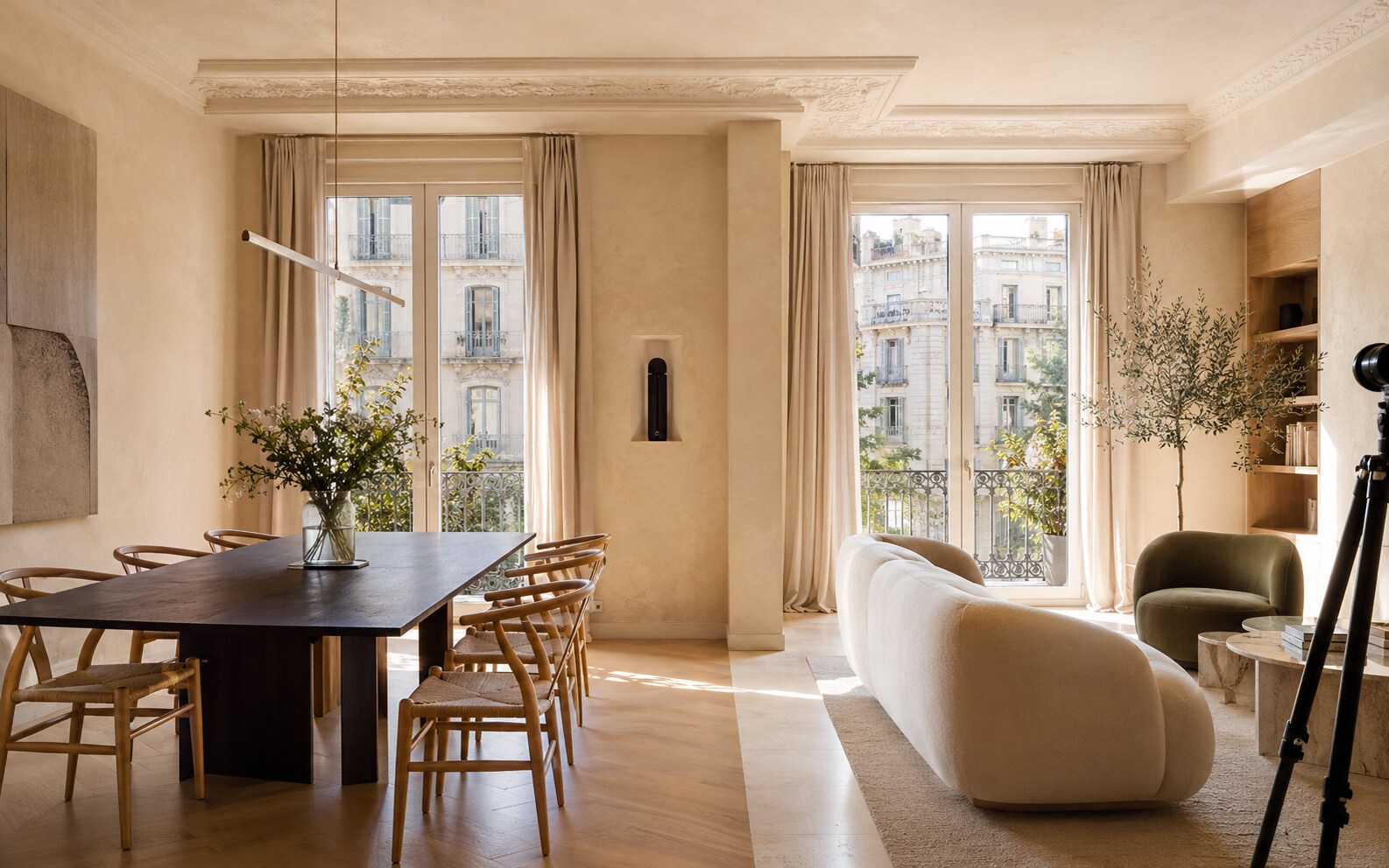
Find a position that affects the design
‘Personal, local and premium’ could describe hundreds of agencies. A useful position is specific enough to shape choices: the neighbourhood you understand street by street, the kind of renovation you know how to value or the selling process you handle differently.
Once that point is clear, the identity can express something more useful than good taste.
A boutique agency becomes recognisable through its judgement, not by using the word boutique.
Make every listing feel like your work
Property imagery will change constantly, so the identity needs a stable frame around it. Typography, copy structure, image editing, plans and social templates should make different homes feel presented by the same agency without making the homes themselves look identical.
This balance matters: the agency needs recognition, but the property remains the product.
- ↗Consistent photography standard
- ↗Listing and brochure templates
- ↗A recognisable writing structure
- ↗Branded but neutral floor plans
- ↗Flexible social formats
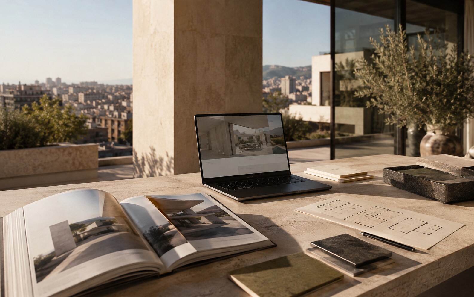
Use design to show the standard
Sellers are not only judging whether an agency can find buyers. They are imagining how their own home will be presented. A coherent portfolio, thoughtful valuation deck and well-designed listing pages make that standard visible before the first meeting.
The design should support proof: real local insight, well-handled sales and properties presented with care.
Build for daily use
An identity fails when it only works in the launch campaign. The team needs templates for new instructions, sold properties, market updates and presentations, all without opening a complex design file every time.
We design the high-visibility moments and the ordinary ones together. Brands are usually recognised through repetition of the ordinary ones.
The strongest property communication starts with one clear decision, then carries it through every touchpoint.