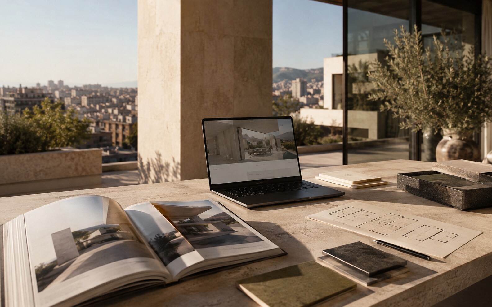
A strong first screen
We would choose one exceptional frame over a rotating carousel every time. The opening should establish the property, its location and one clear next step. Luxury is often communicated by what the interface is confident enough to leave out.
- ↗Clear project name and location
- ↗One strong visual
- ↗Short value proposition
- ↗Visible enquiry action
Make information effortless to find
Buyers should not have to hunt for the floor plan because it ruins the composition. We structure the page in the order people naturally evaluate a home: feeling first, then spaces, details, location, availability and contact.
If an effect makes the property harder to understand, it is not adding value.
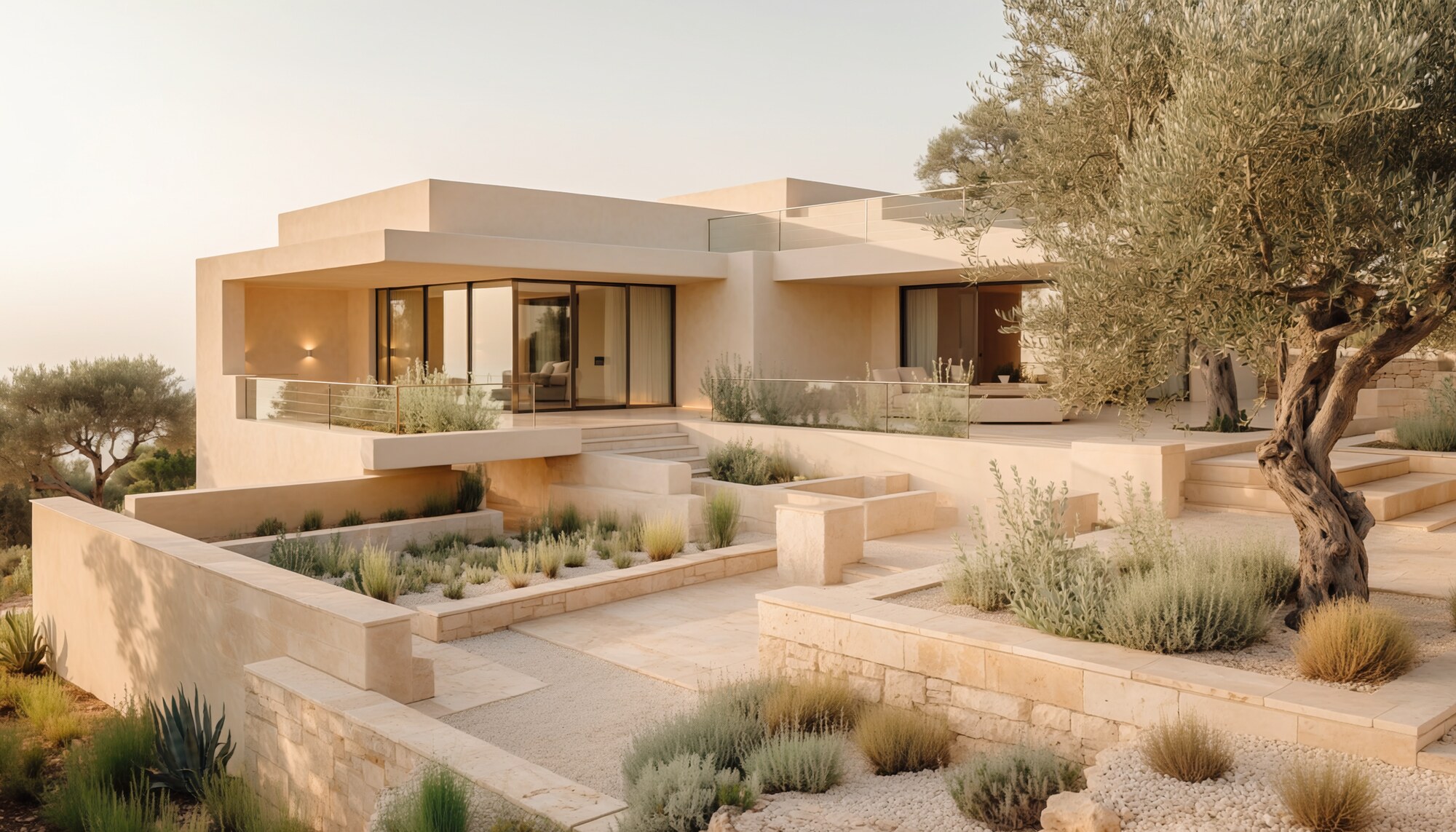
Quality includes performance
A six-second black screen before the film loads is not cinematic. It is slow. We optimise every image, crop and interaction for the phone someone actually uses outside the studio Wi-Fi.
- ↗Optimised responsive images
- ↗Fast mobile loading
- ↗Accessible colour contrast
- ↗Simple enquiry forms
- ↗Clear image crops on every screen